Small bathrooms can feel tricky, but color has a quiet power to change everything. The right palette reflects light, softens edges, and makes even the tightest space feel open and calm.
These color schemes are the ones designers lean on when they want small bathrooms to feel brighter, airier, and effortlessly larger.
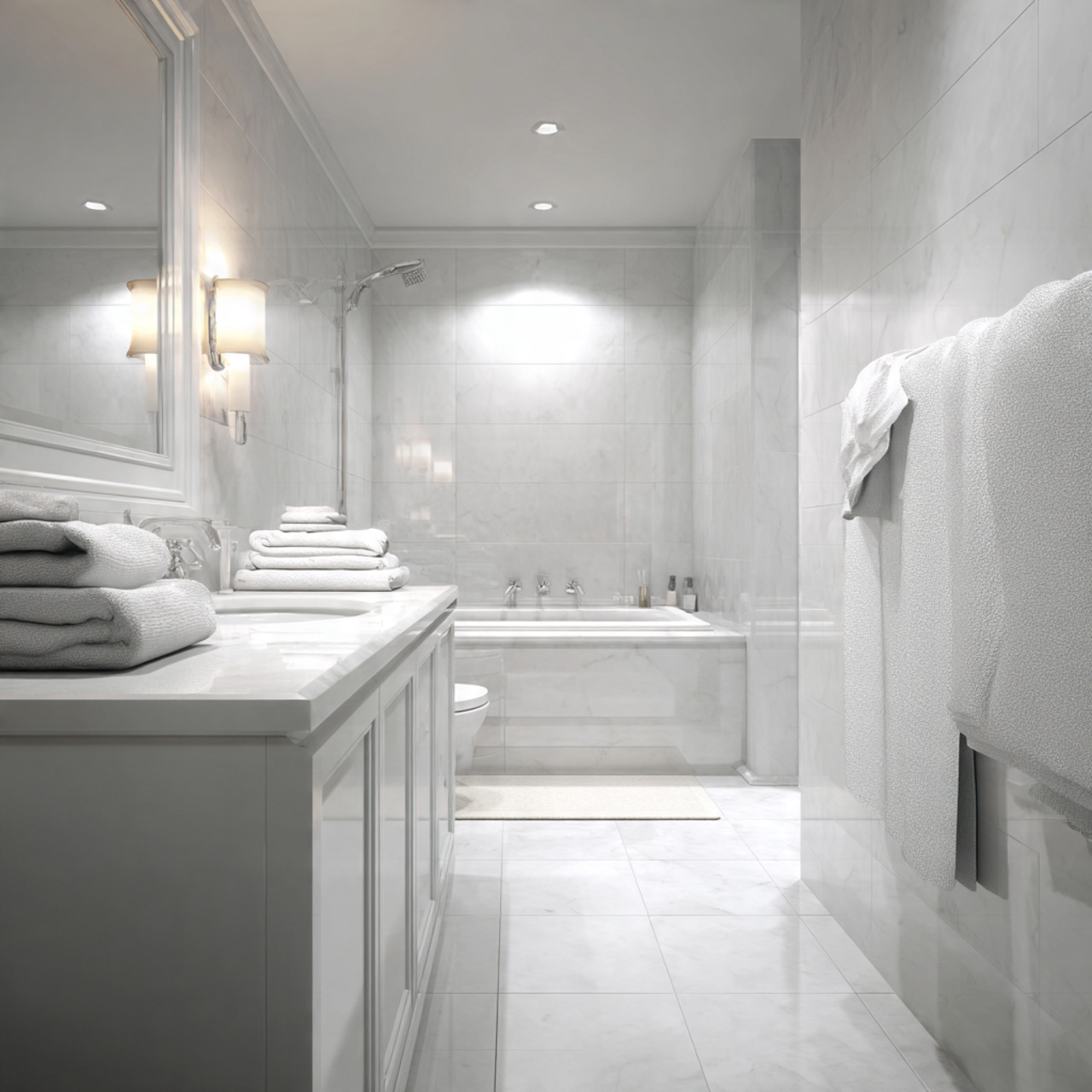
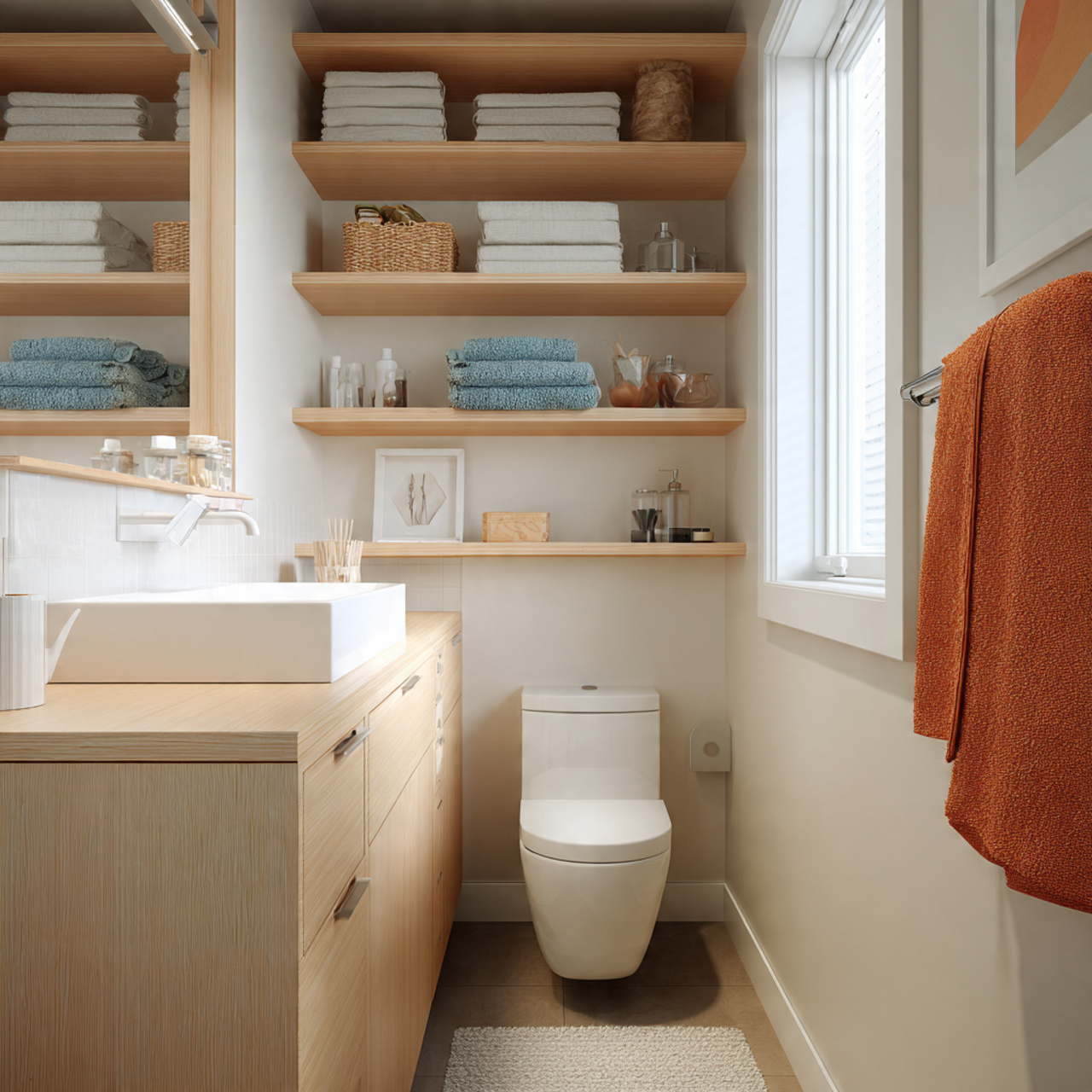
1. Soft White Bathroom with Warm Undertones and Natural Light
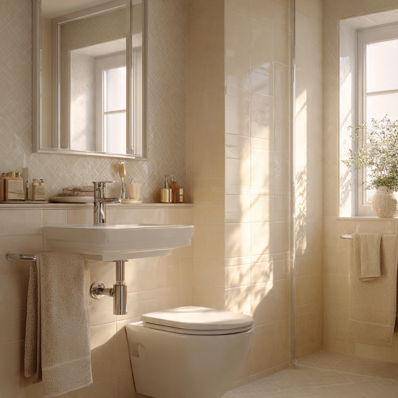
This bathroom feels open the moment you step inside. Soft white walls with warm undertones bounce light gently, avoiding that cold, sterile feeling. The space feels calm, balanced, and surprisingly roomy, even with minimal square footage.
The warmth in the white helps blur hard edges, especially where walls meet the ceiling. Paired with simple fixtures and clean lines, the bathroom feels breathable and light, almost like the walls quietly step back.
A few details help complete the look:
- Cream towels instead of bright white
- Soft brushed metal fixtures
- Light grout that blends into the tile
2. Pale Greige Bathroom with Seamless Wall and Floor Flow
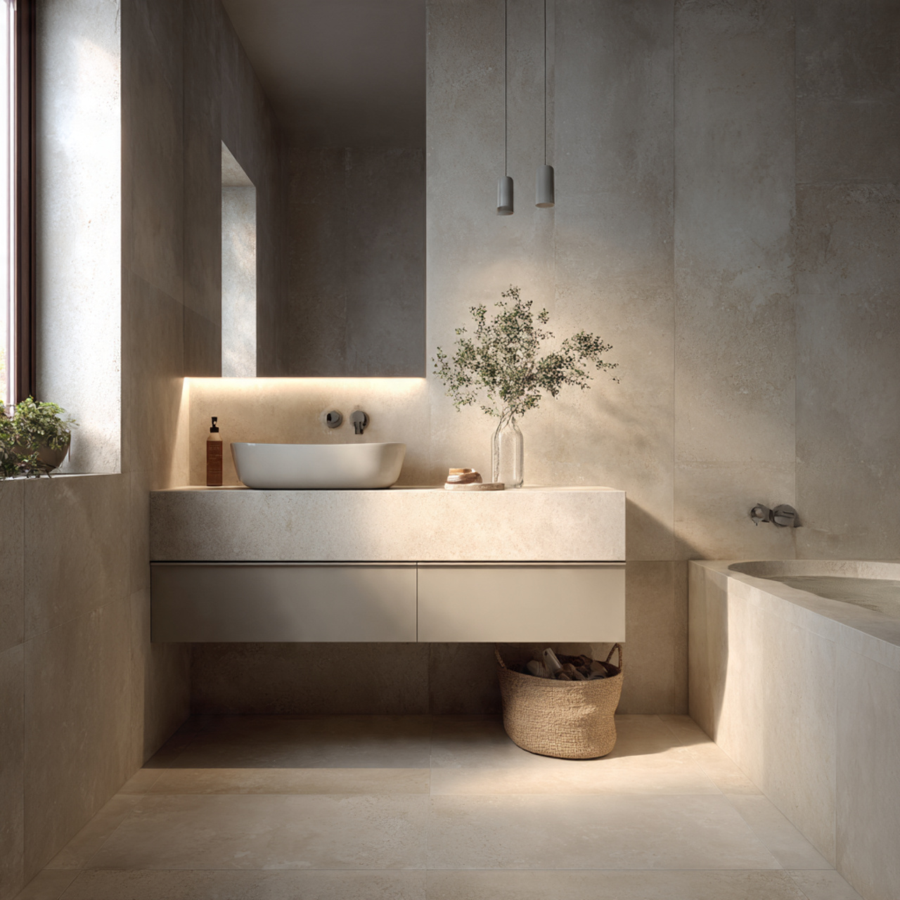
Pale greige is one of those colors that quietly does everything right. It sits between beige and gray, creating softness without losing clarity. In a small bathroom, it helps surfaces feel connected rather than broken up.
Using the same greige tone on walls and floors creates visual flow. The eye moves smoothly through the space, which naturally makes the room feel larger and more open.
This palette works beautifully with minimal contrast. When cabinetry, tile, and walls feel related, the bathroom reads as one calm, cohesive space rather than several tight sections.
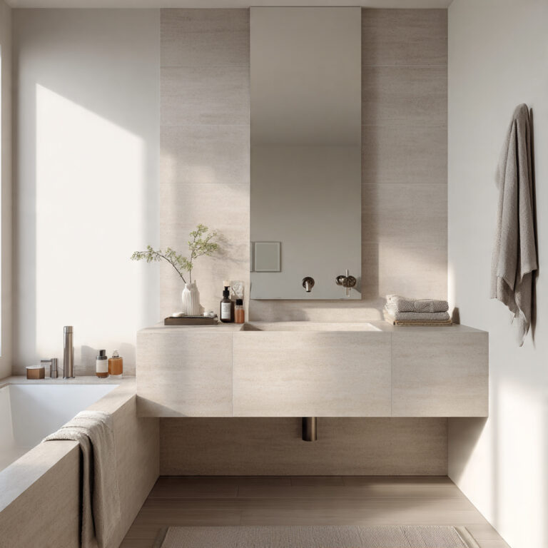
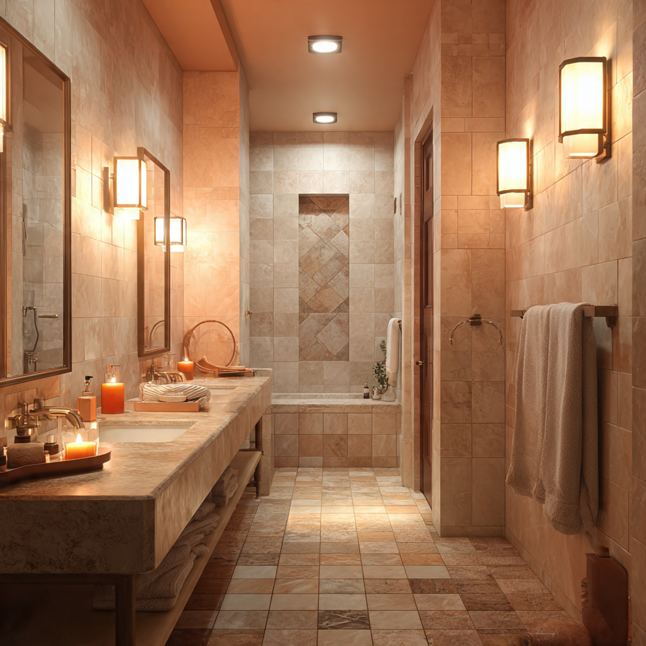
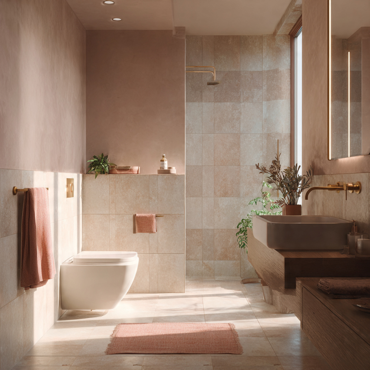
3. Light Beige Bathroom with Subtle Contrast and Soft Texture
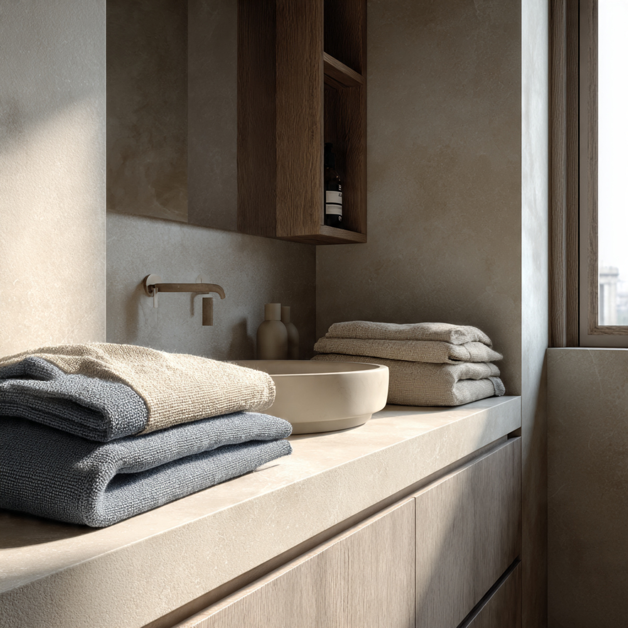
Light beige brings warmth without heaviness. In a small bathroom, it creates a welcoming atmosphere while still reflecting light. The key is keeping the shade soft and avoiding anything too yellow or dark.
Texture plays an important role here. Matte finishes, gentle stone patterns, or lightly textured tiles add depth without closing in the space. Everything feels layered but still light.
This palette pairs well with:
- White or ivory trim
- Soft linen or cotton textiles
- Light wood accents for warmth
4. All White Bathroom with Layered Finishes for Depth
An all white bathroom does not have to feel flat. When done well, it actually feels expansive and refined. The secret is layering finishes instead of relying on one flat white surface.
Glossy tiles, matte walls, and soft textiles create gentle contrast without adding color. Light reflects differently across each surface, giving the room movement and dimension.
This approach works especially well in bathrooms with limited natural light. The layers help prevent the space from feeling washed out while still keeping everything visually open.
5. Cream and Sand Bathroom with a Calm Open Feel
Cream and sand tones create a relaxed, spa-like mood that naturally opens up a small bathroom. These shades feel soft and continuous, helping the room feel less boxed in.
The palette works best when colors stay close in value. Cream walls paired with sand-toned tiles keep the look cohesive and easy on the eyes. Nothing competes for attention.
To keep it feeling airy:
- Use light grout instead of dark
- Stick to simple silhouettes
- Choose warm metals over harsh chrome
6. Soft Gray Bathroom with Minimal Contrast and Clean Lines
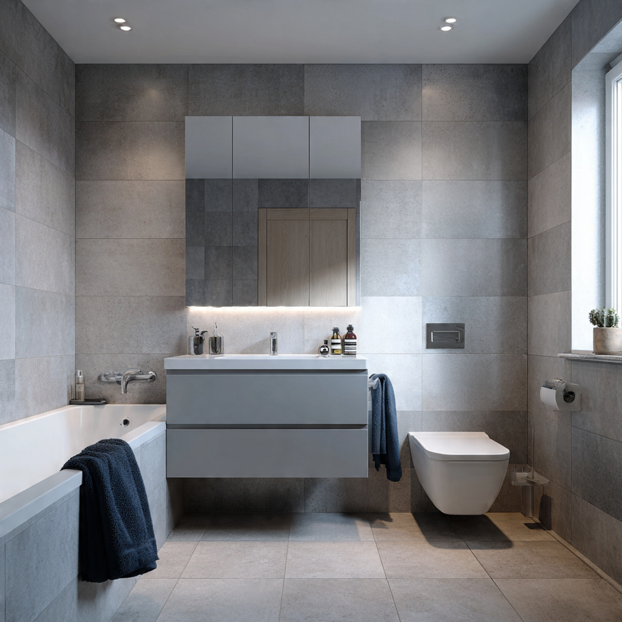
Soft gray can feel incredibly spacious when used gently. In small bathrooms, it works best when contrast is kept low and finishes stay simple. The result feels clean, modern, and quietly elegant.
Gray walls paired with similar toned tiles help blur boundaries. Instead of chopping the room into sections, everything flows together in a calm, uninterrupted way.
This palette shines when paired with:
- White ceilings for lift
- Minimal hardware
- Clean, straight lines in fixtures
7. Light Taupe Bathroom with Stone Inspired Elegance
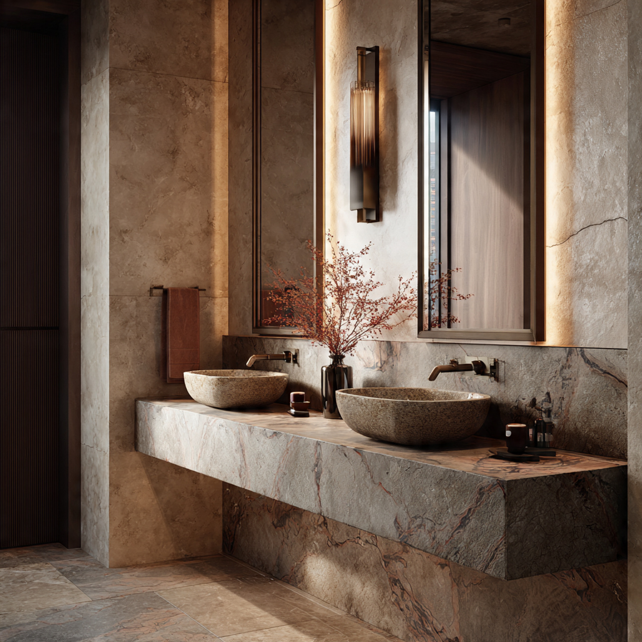
Light taupe brings in a natural, grounded feeling without making the space feel heavy. It sits beautifully between warm and cool tones, which helps the room feel balanced and open.
Stone-inspired finishes enhance this effect. Soft veining or subtle texture adds depth while keeping the palette calm and continuous. The space feels refined, not busy.
Taupe also plays well with warm lighting. Soft light enhances the color’s depth and keeps the bathroom feeling welcoming rather than flat.
8. Pale Blue Bathroom with Airy Coastal Energy
Pale blue instantly brings a sense of air and openness. In small bathrooms, it creates a visual connection to sky and water, which naturally makes the space feel larger.
The key is keeping the blue soft and muted. Think misty, powdery shades rather than bold or saturated tones. This keeps the look light and calming.
To balance the palette:
- Pair with white or ivory surfaces
- Use simple tile patterns
- Add natural textures like cotton or wood
9. Sage Green Bathroom with Muted Restful Tones
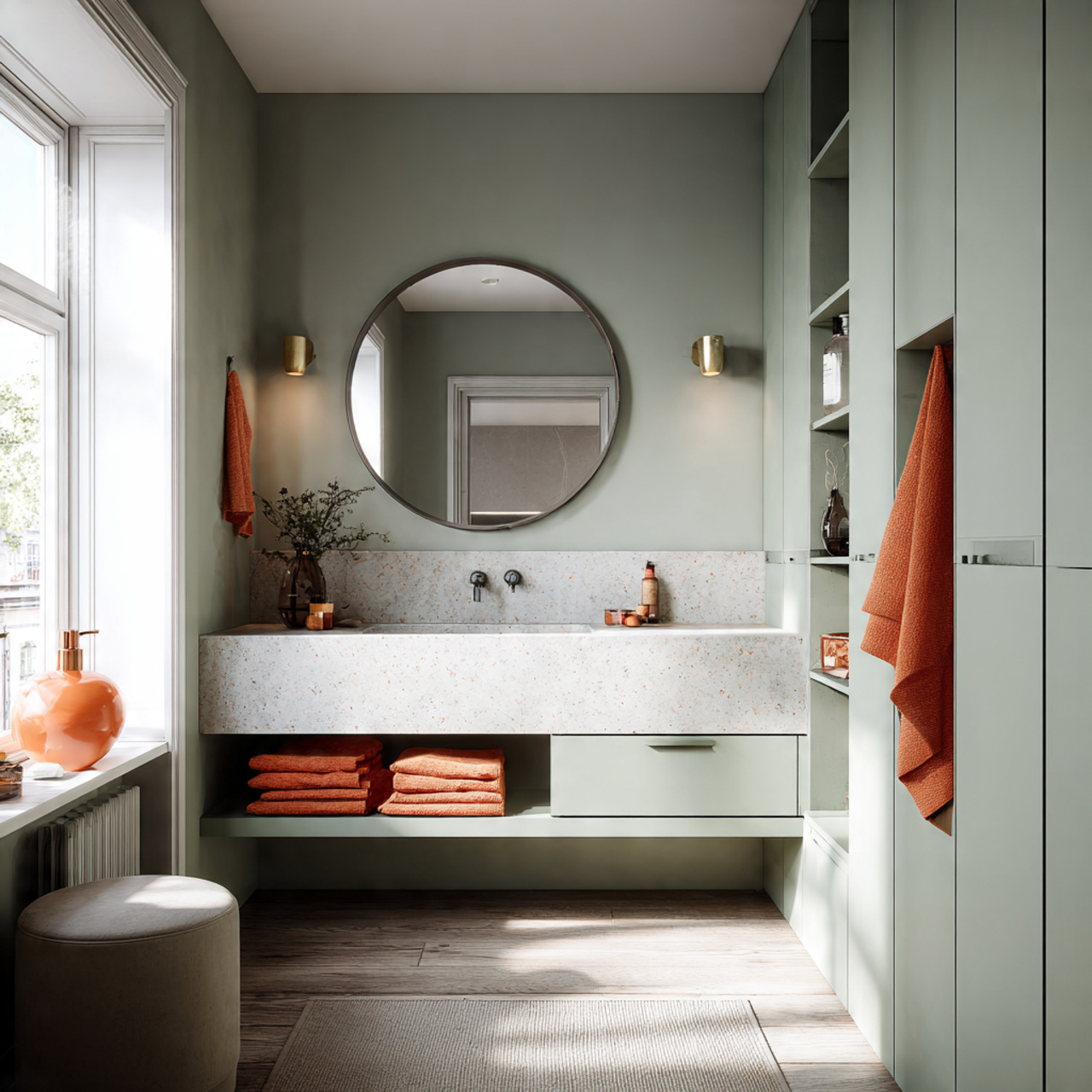
Sage green has a grounding quality that still feels light enough for small spaces. When muted and soft, it opens the room while adding a subtle sense of depth.
This color works beautifully on walls or cabinetry. It adds interest without overpowering the space, especially when paired with light stone or white finishes.
Sage green feels especially calming in bathrooms used for winding down. The space feels peaceful, balanced, and visually larger than it actually is.
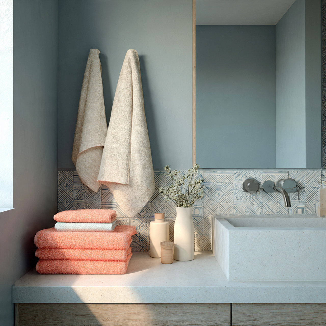
10. Blush Neutral Bathroom with Gentle Warmth and Light Reflection
Blush neutrals offer warmth without heaviness. In small bathrooms, they reflect light softly and create a welcoming glow that makes the room feel more spacious.
These tones work best when they lean neutral rather than pink. Think dusty blush, clay, or soft rose beige. The result feels subtle and refined.
Blush pairs well with:
- Warm white surfaces
- Brass or brushed gold accents
- Soft natural textures
11. Soft Charcoal and Off White Bathroom with Balanced Contrast
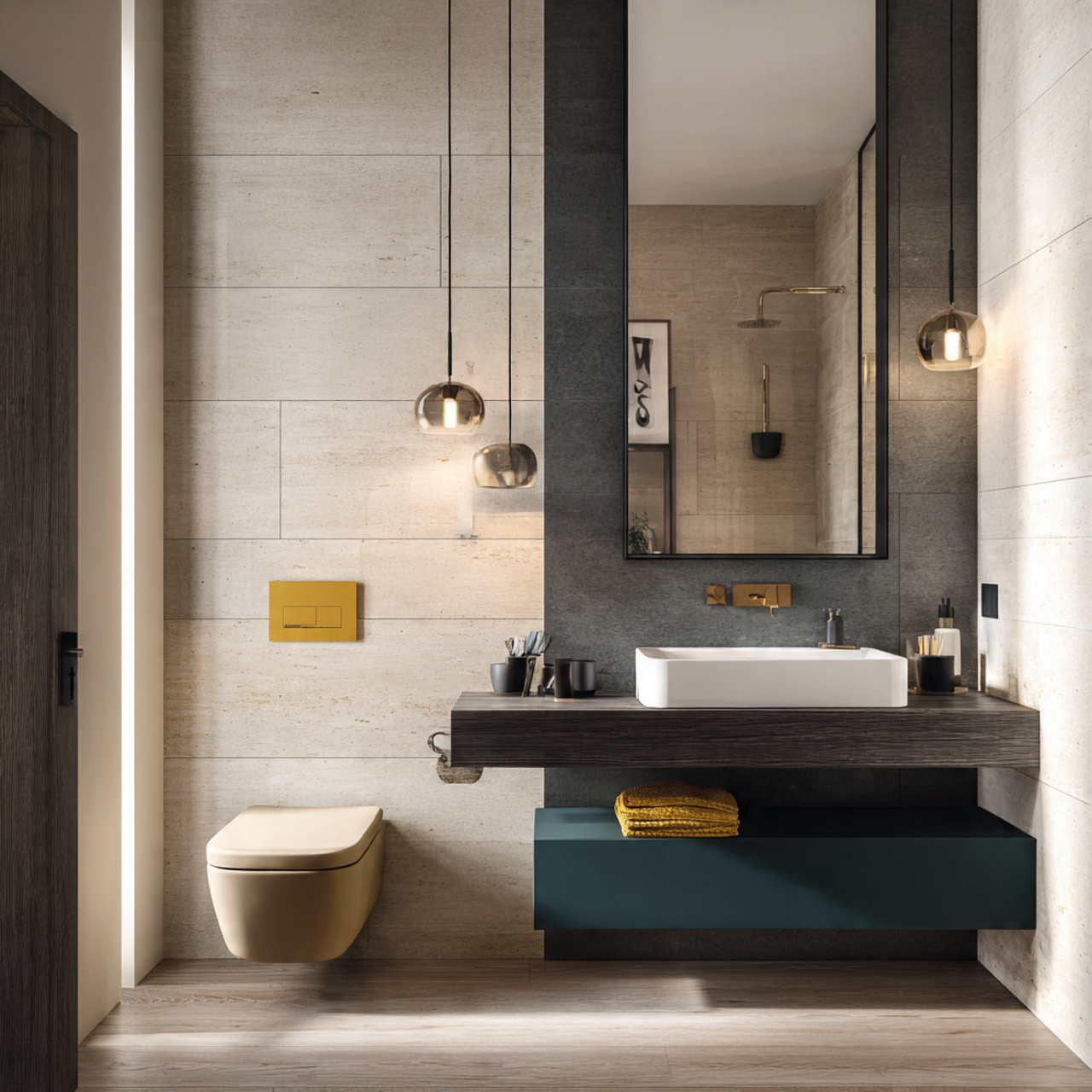
Dark colors can work in small bathrooms when used thoughtfully. Soft charcoal paired with off white creates contrast without closing in the space.
The trick is balance. Keeping most surfaces light while using charcoal as an accent adds depth and structure. The bathroom feels defined but still open.
This palette works especially well with:
- Vertical surfaces in lighter tones
- Minimal patterns
- Clean, modern fixtures
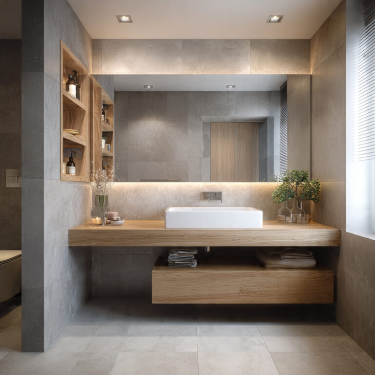
12. Warm White and Light Wood Bathroom with Scandinavian Simplicity
Warm white paired with light wood feels effortlessly open. This combination brings softness and warmth while keeping the space visually simple and uncluttered.
Light wood tones add texture without darkening the room. The natural grain keeps the space interesting while the white keeps everything bright and airy.
This palette benefits from restraint:
- Limit decorative items
- Use simple wood finishes
- Keep hardware minimal
13. Ivory Bathroom with Soft Metallic Accents
Ivory sits slightly warmer than white, which helps small bathrooms feel inviting rather than stark. It reflects light beautifully while adding a touch of softness.
Soft metallic accents, like brushed brass or champagne finishes, enhance the warmth without adding visual weight. The space feels elegant and open.
This approach works well in bathrooms with limited natural light. The warm tones help prevent shadows from feeling harsh or heavy.
14. Misty Green Gray Bathroom with a Calm Spacious Mood
Misty green gray is subtle, airy, and surprisingly expansive. It blends the calm of green with the openness of gray, creating a soothing backdrop.
In small bathrooms, this color helps surfaces feel further apart. The room feels gentle on the eyes, which naturally makes it feel larger.
Paired with simple finishes and soft lighting, this palette creates a peaceful environment that feels both modern and timeless.
15. Monochrome Light Neutral Bathroom with Seamless Transitions
Using one light neutral shade throughout the bathroom creates a seamless look that visually stretches the space. Walls, floors, and even fixtures feel connected.
This monochrome approach reduces visual breaks, which helps the room feel less confined. Everything flows together calmly and quietly.
To keep it interesting:
- Vary textures instead of colors
- Mix matte and glossy finishes
- Use subtle pattern sparingly
Conclusion
Choosing the right color scheme can completely change how a small bathroom feels, without touching the layout or doing any major work. Soft tones, gentle contrast, and cohesive palettes help the space breathe and feel more open.
When colors flow easily and light is reflected well, the room naturally feels calmer, brighter, and larger than it actually is.